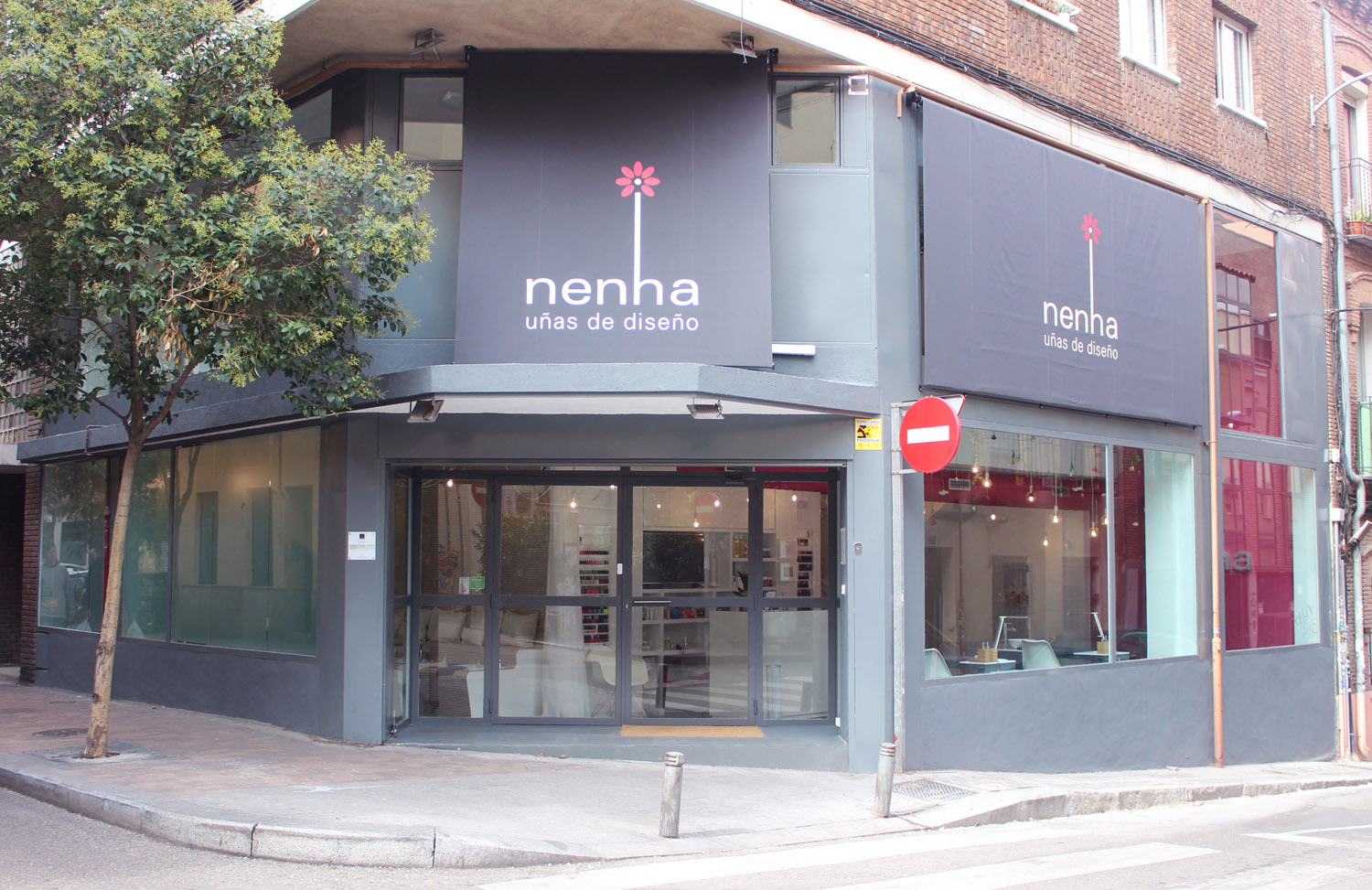
Nenha Hernani,49
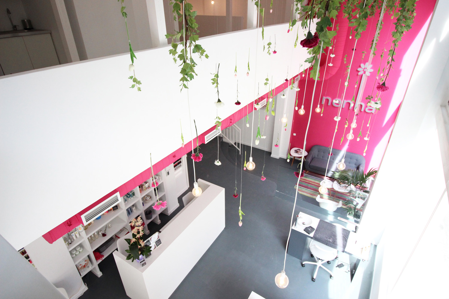
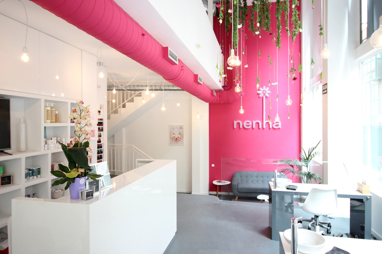
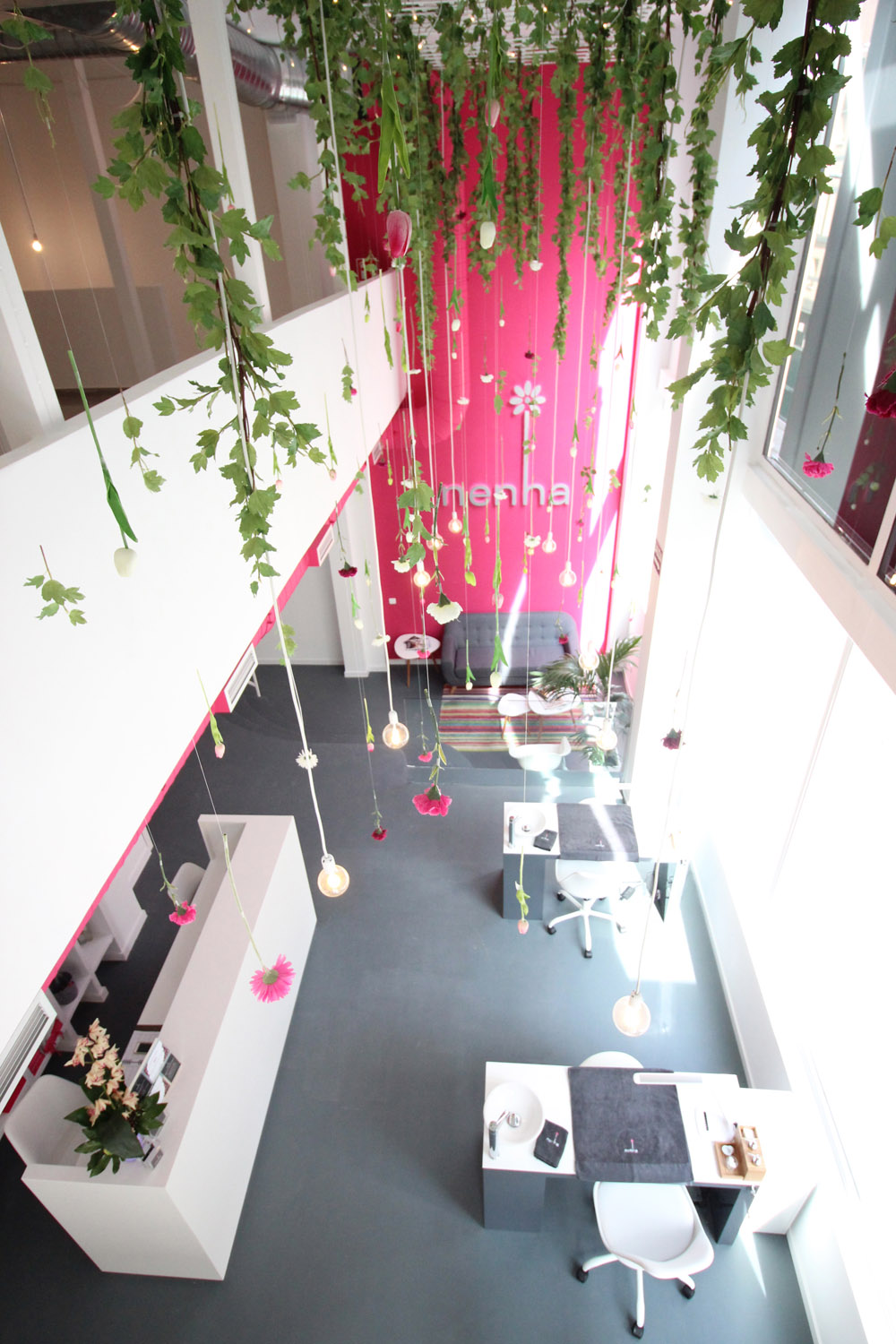
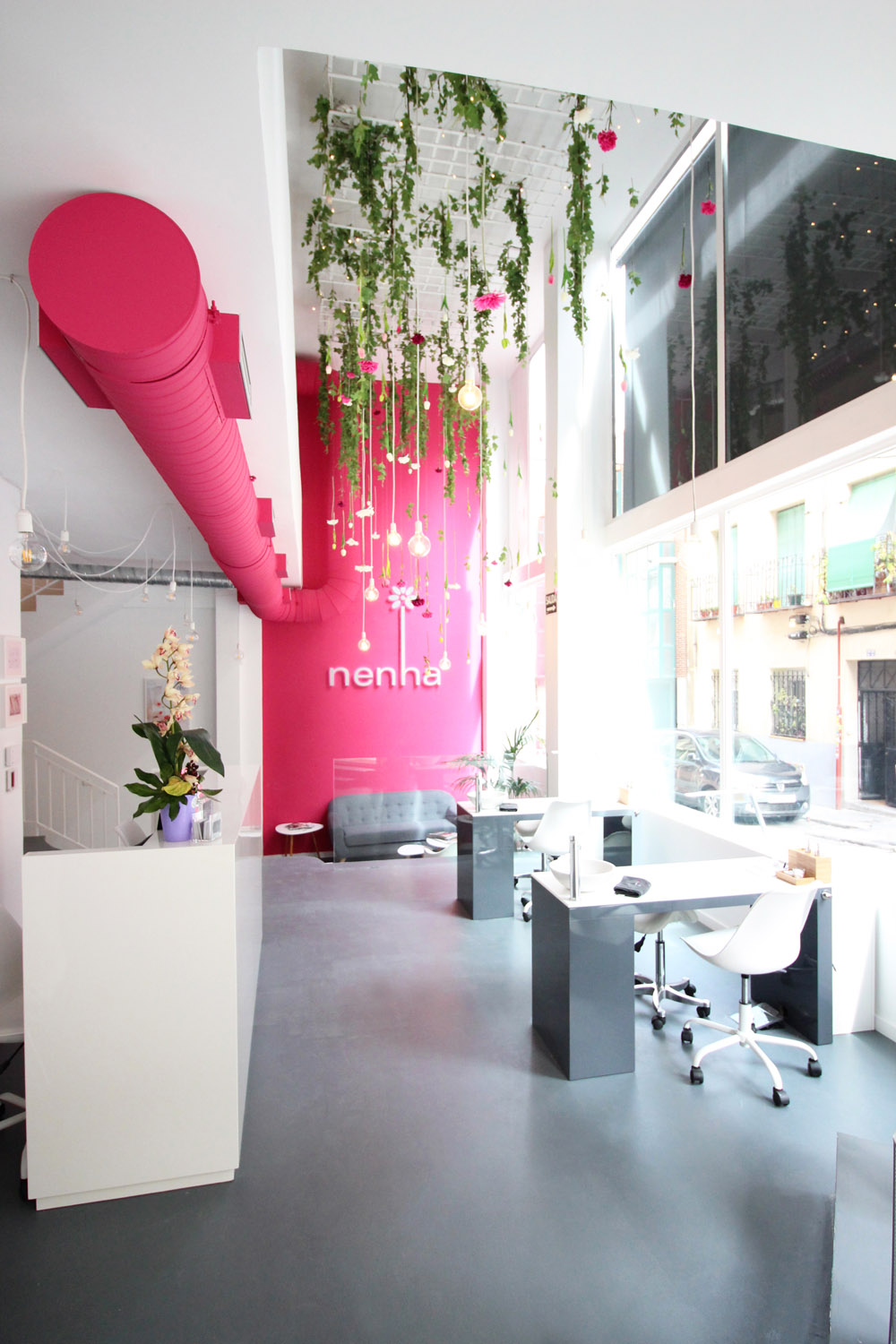
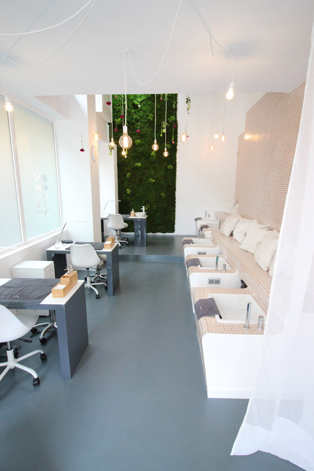
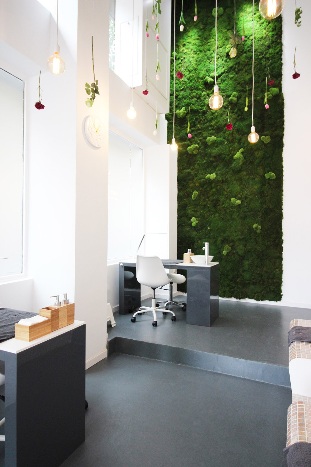
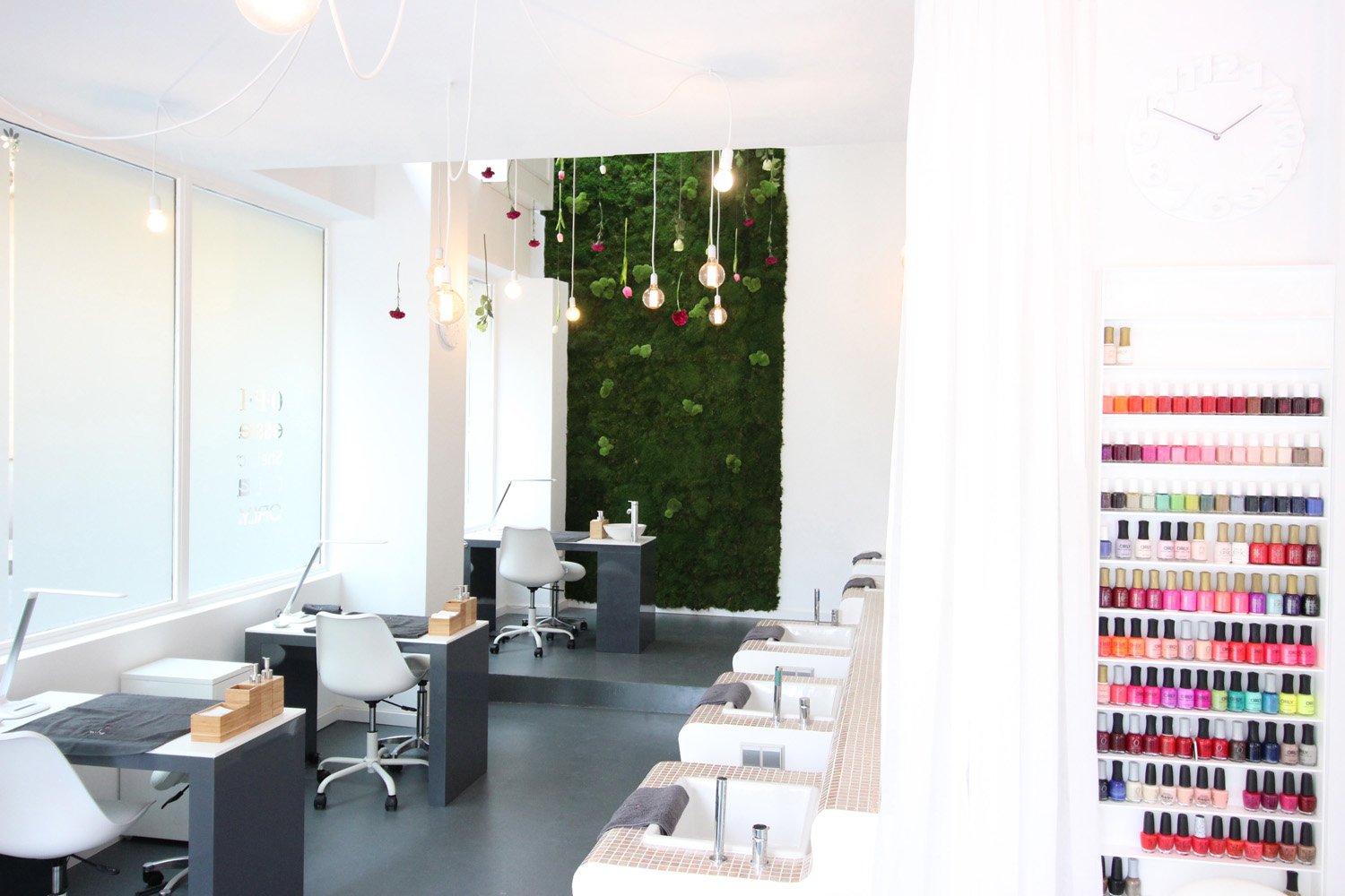
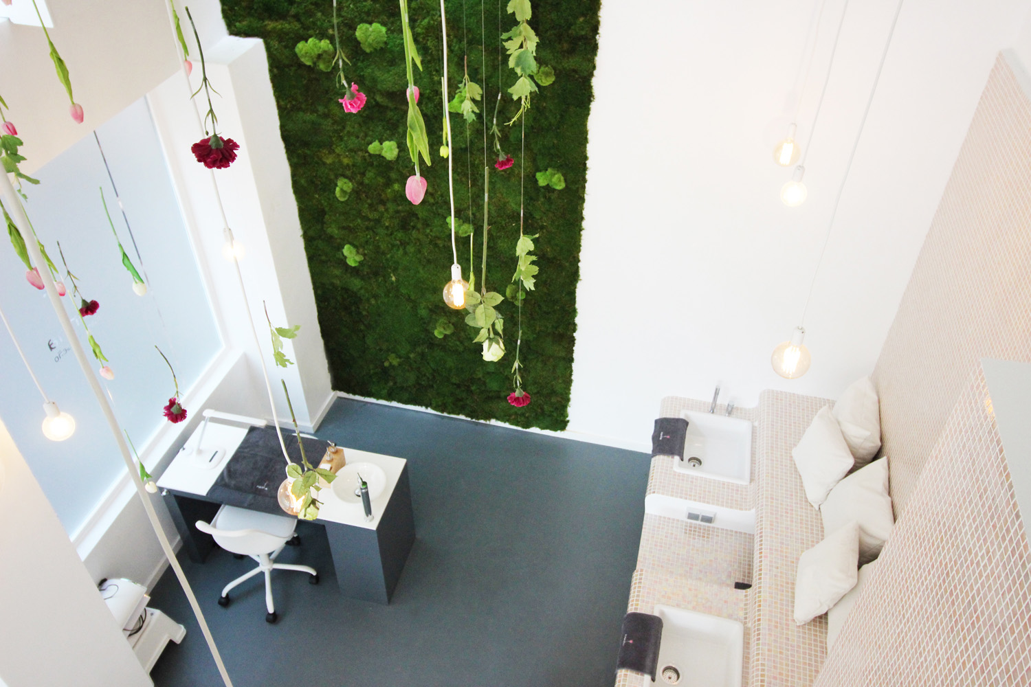
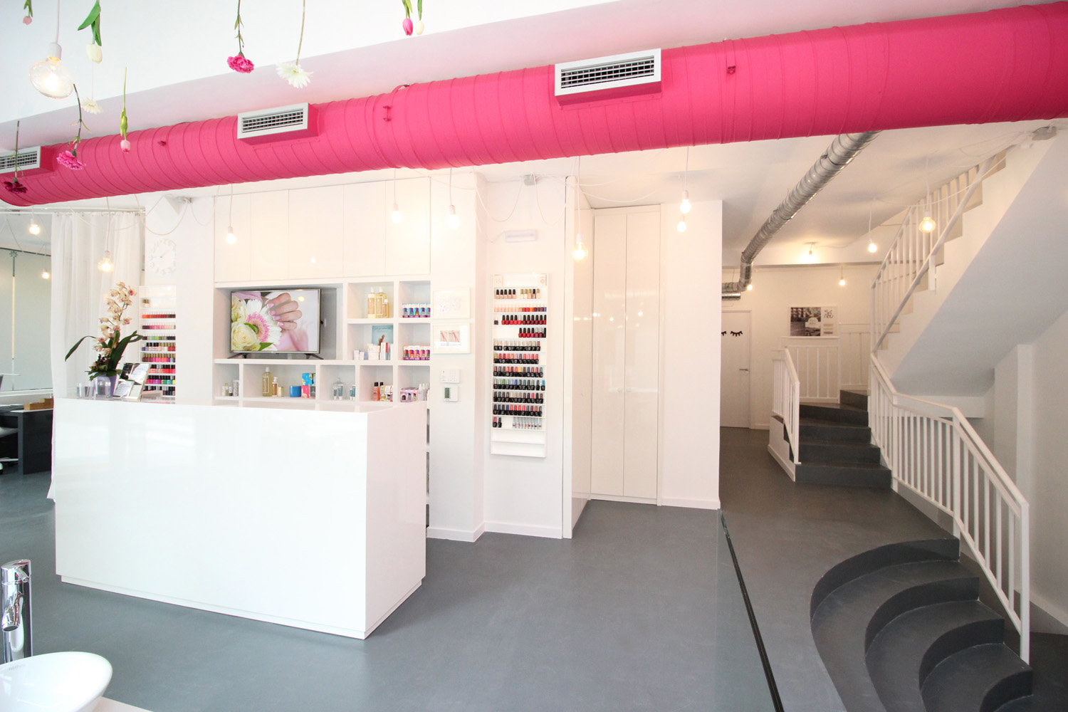
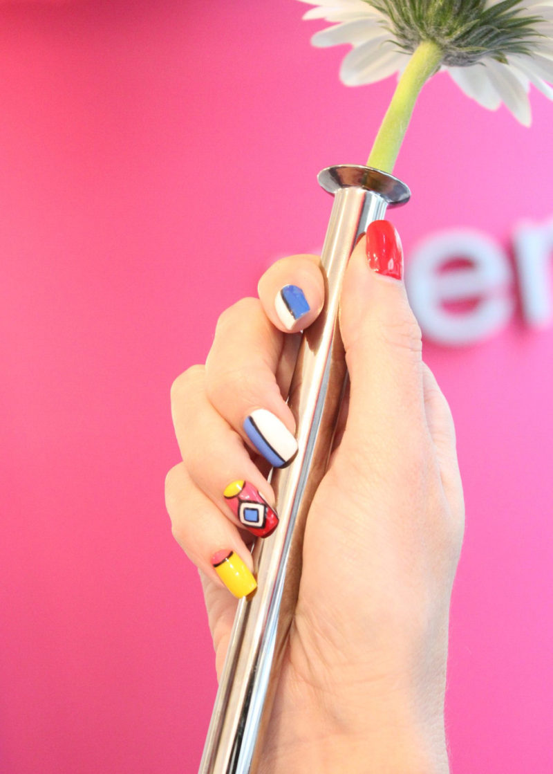
This is the second Nenha beauty salon in Madrid, after opening its first one in the Barrio de Salamanca (2010). The idea was to open a second and larger centre that could become the headquarters of the brand and host training services. We wanted to reflect the brand identity using their corporate colours and play with the symbolism of the logo. The logo, which I designed years ago, has a flower on top with nail petals representing the ideal of beauty so we wanted to transfer this idea to the whole space, creating an atmosphere of beauty and wellbeing in harmony with nature. Hence the importance of flowers and the vertical garden playing with light.
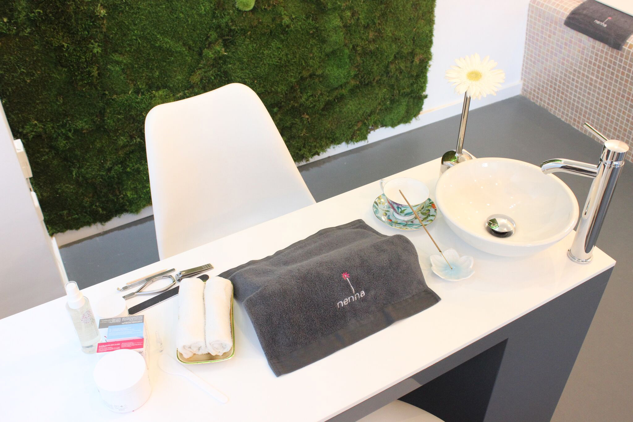
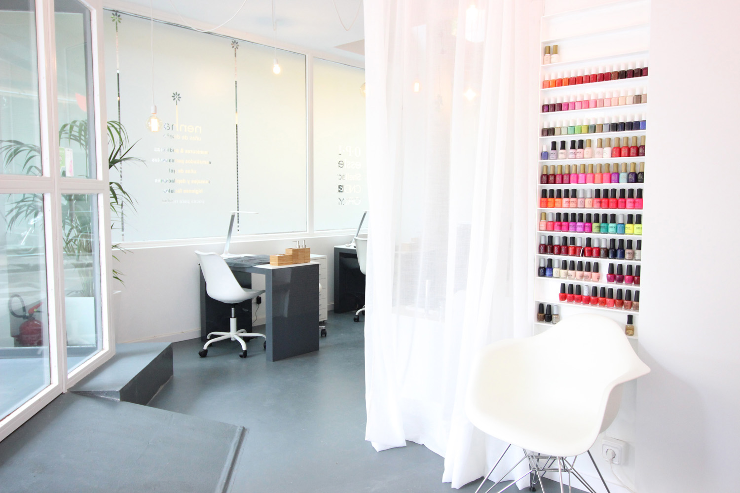
The reception desk and all the manicure tables were custom designed and executed in Oporto by a team of craftsmen with whom I have already worked on other projects. The SPA for pedicure was also exclusively designed, as in its previous centre, becoming already a symbol of the brand. We wanted the interior design of both centres to be different but preserving the same philosophy, colour corporate guidelines, creativity and originality.
The goal has always been to create an atmosphere of well-being and relaxation through beauty for all those customers who want a moment of disconnection, also reflecting the values of quality and professionalism of the brand.
Location
Madrid (Spain)
Date
06/10/2016
Category
Interiors

